
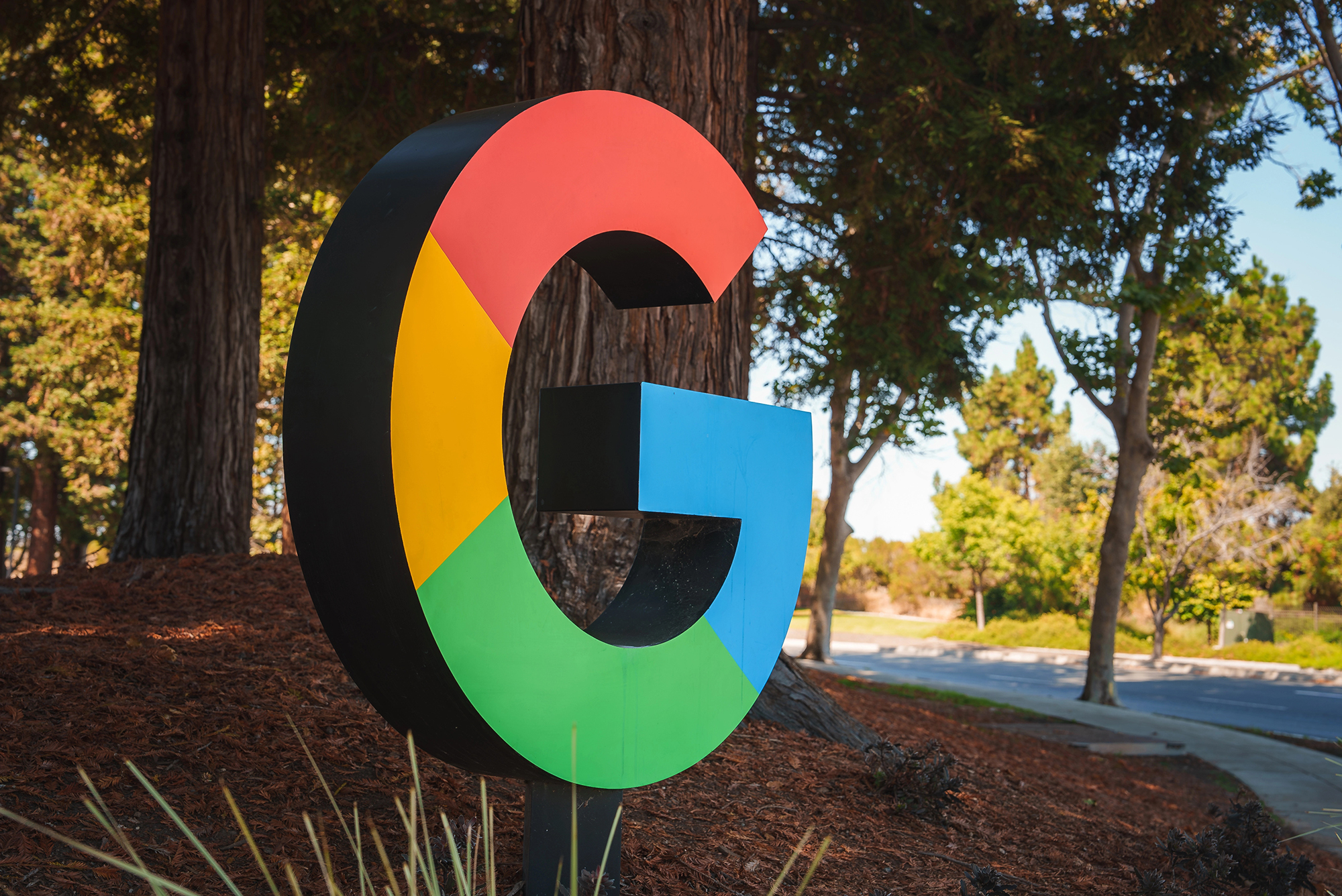
The previous update of the Google logo happened 10 years ago. Since then, everyone has gotten used to seeing the letter «G» made up of four colored segments — now there are no segments.
On September 1, 2015, Google significantly updated its full word logo with a modern font called Product Sans. The «G» icon changed from a small white letter «g» on a blue background to a familiar image.
The letter retains its outline, but red now smoothly fades into yellow, yellow — into green, and green — into blue. The colors appear more vibrant, and the gradation matches gradient of the Gemini logo.
The new icon is already used by Google Search for iOS after yesterday’s update. On Monday, the icon appeared on Android along with the Google 16.18 (beta) app. It’s a minor change that many people won’t notice right away. It is even less noticeable in the tiny icon in the browser.
It doesn’t look like Google will update its full logo. It’s also unclear whether the logos of the company’s other apps will change, but it’s easy to imagine the same smooth transition in them.
Source: 9to5google
Spelling error report
The following text will be sent to our editors: